Well done! You finally have an awesome sleek new website. It has a beautiful homepage showcasing the products you sell, great UX and product finding features to facilitate easy shopping, and large clear images and descriptions that entice your customers to add to cart. But there’s a problem. You’ve noticed that nothing is selling! “How is this so?” you ask yourself. You have included everything you think the customer wants to see and allowed them to find whatever they want with ease.
So what’s gone wrong?
If you look at your Google Analytics1, you may see that your checkout process is causing customers to abandon their carts and browse elsewhere. Don’t fret though, this is actually very common! On average, 24%2 3 of customers abandon their cart during the checkout process. This can be for several reasons, such as being asked to create an account or the checkout process itself being too long and complicated.
The simplest analogy to show what went wrong is this:
Imagine you, as a customer, go into a shop to buy a product. Everything is nicely laid out in easily navigable aisles, every product has a price and a detailed description, plus you like the look of the packaging. An easy decision! You head to the checkout and get ready with your credit card, but the cashier asks you to register in order to check out. Not only that, they even ask you to fill out a checkout form with multiple fields that ask for your name, address, and other personal information! You then spend over 5 minutes filling this information out. Once the purchase is completed, you go to another store and have to go through the same process all over again. You find yourself exhausted and begin to reconsider which products will be worth the effort.
There you have it: the answer to why your conversion is down! You may have an awesome website, but your checkout experience has so many hurdles for the customer to clear that it becomes tedious for them to complete it. If you remove or lower the number of these hurdles, the customer will feel like the process is less of a hassle.
The customer wants a quick and easy checkout flow, but with so many obstacles and distractions (account sign up processes, newsletter overlays, promotional overlays, passwords, etc), you’ve exhausted them out before they can even hit the checkout page. At this point, they will likely abandon the site and go elsewhere. Even with all your cookies fine tuned and with a quick, beautiful browsing experience, customers may not even want to return in the future. After all, time well saved is money well spent.
Typically, many websites require multiple steps to allow the user to complete their purchase.
As an example, your customer may need to:
- Locate the product
- Scan the product page to locate and click the ‘Buy Now’ button
- Be redirected to a registration page since they aren’t signed in. (The problem begins here, as new customers might not necessarily want to register just to purchase one product.)
- Complete multiple sign up fields and get an email sent to confirm the email address.
- Locate the account confirmation email and click on a link which sends them back into the checkout page.
- Sign in again using their newly created credentials.
- Start the checkout process.
- Enter payment method and credit card information, but be met by an error.
- Realize that they’ve entered the billing address incorrectly.
- Finally, once they’ve corrected the incorrect text entry, they click the Process Payment button again. Congratulations, they have finally completed the purchase.
Phew!! What a consumption of time and energy for those hilarious pug socks the customer wanted to buy for their significant other!
But what could be done to save your customer time and reduce their frustration? We have you covered. Arctic Leaf works with some of the most successful e-commerce platforms, which each come with a fantastic and effective checkout process by default. But Arctic Leaf won’t stop there! As well as ensuring your checkout needs are fully met, we follow best practices as we dive into your checkout process with a fine-tooth comb to tailor it to your needs beyond the original “out of the box” solutions.
Here are a few ways in which we have used UX best practices and industry standard guidelines to make a checkout process that is unlike any other out there:
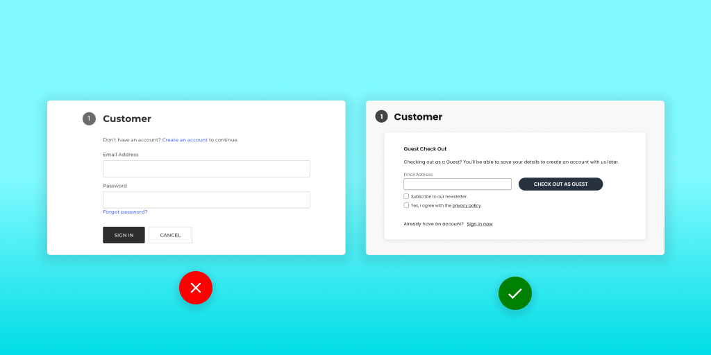
1. Simplified the checkout experience by including a ‘Guest Checkout’ process. With Guest Checkout, the customer won’t need to register for an account to purchase. They just enter their credit card and delivery details once, pay, and that’s it.
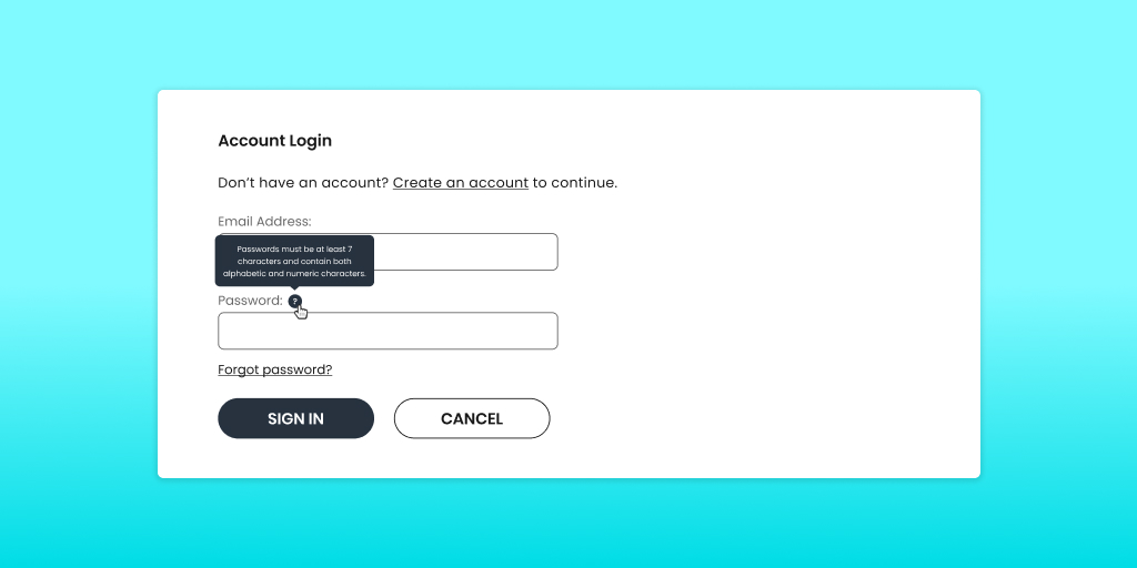
2. Included tooltips and guidances for passwords, email addresses and payment information.
3. Improved the checkout page layout and created a comprehensible checkout flow with all the information you need in the places you expect to find it. There is a time and place for a game of ‘Where’s Waldo’ and, unfortunately, this isn’t it.
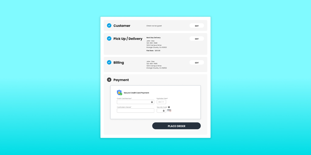
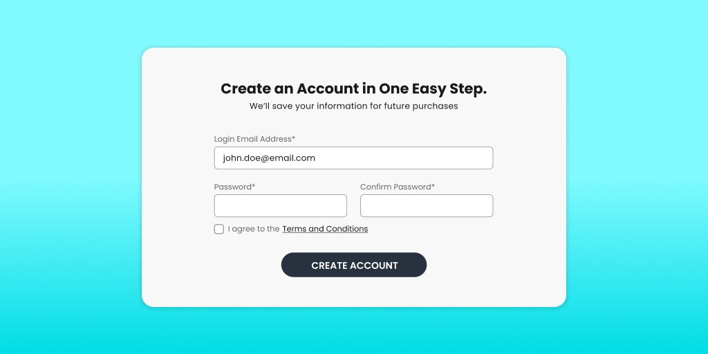
4. Created an uninterrupted checkout flow by allowing customers to save their information for a future purchase. It’s important to let customers opt in and create a profile, but we make sure to prompt after the checkout process so that they aren’t taken out of the process. You can even use cookies to persist information such as addresses and save them time during sign up.
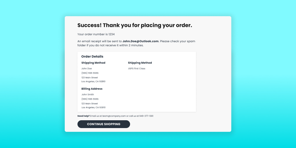
5. Instilled purchase confidence in the customer by acknowledging that their order has been successfully placed. A confirmation page with all important order information and following up with a detailed order confirmation email is pertinent to creating customer trust.
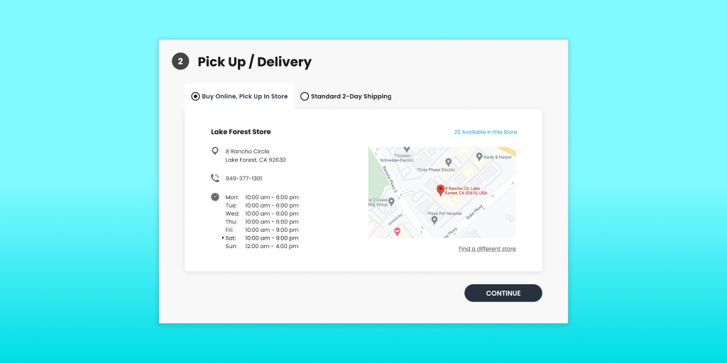
6. And more! There are many other improvements we can make to the checkout process with the use of third-party apps that specialize in “buy online, pickup in store” (BOPIS), shipping estimates and information, or forms and address validation. These typically come with an added cost, but go a long way to rectify and alleviate many major checkout pitfalls4.
There you go, we have implemented these improvements into your checkout process to make customers happy, improve your site’s conversion, and give you peace of mind. You can now go and relax on a beach and enjoy life. That is, until you’re ready to learn how to convert that customer into a returning customer!
If you’re interested in learning more ways to improve your customers’ checkout experience or have any questions about how to create a seamless shopping experience, feel free to reach out to our team directly at info@arcticleaf.io.
Arctic Leaf is a digital agency with over 10 years of e-commerce experience serving clients of all industries. Our entire team is Baymard UX certified and our amazing developers can build everything from simple Shopify themes to fully custom headless experiences.
1 Arctic Leaf Inc.(2023, February 9th) Unlocking the Future of Data with Google Analytics 4 (GA4)
https://www.arcticleaf.io/learning-center/ontap-recap-google-analytics-4
2 Baymard Institute (2023, January) Always Provide Users with a “Guest Checkout” Option.
https://baymard.com/premium/guideline-collections/uxs2vv/637 (Paid Article Access)
3 Baymard Institute (2023) 62 Cart & Checkout UX Articles
https://baymard.com/blog/collections/cart-and-checkout (Free Article Access)
4 Baymard Institute (2021, November 8th) The Current State of Checkout UX - 18 Common Pitfalls & Best Practices.
https://baymard.com/blog/current-state-of-checkout-ux